

ナビゲーションがなくてとっても不便だったので追加することにしました。
Bootstrap4を活用したヘッダーってどんなのだ?と思って見た記事がこちら。

301 Moved Permanently
shared-blog.kddi-web.com
ふむふむ。Bootstrapのサイトに、サンプルコードがあるとな。
というわけで行ってみました。
…が、こちらはver3.3だったので…

Getting started · Bootstrap
Bootstrap, a sleek, intuitive, and powerful mobile first front-end framework for faster and easier web development.
getbootstrap.com
4はこっち。

Examples
Quickly get a project started with any of our examples ranging from using parts of the framework to custom components an...
getbootstrap.com
この中から「Blog」のデザインをチョイス。
画像をクリックすると実際にそのデザインが使われたサイトが表示されるので、ソースコードを見てhtmlの内容とcssの内容を確認。
当サイトのheader.phpとindex.php、style.cssを編集しました。
<!DOCTYPE html>
<html>
<head>
<meta charset="utf-8">

<?php wp_head(); ?>

</head>
<body>
<script>
  (function(i,s,o,g,r,a,m){i['GoogleAnalyticsObject']=r;i[r]=i[r]||function(){
  (i[r].q=i[r].q||[]).push(arguments)},i[r].l=1*new Date();a=s.createElement(o),
  m=s.getElementsByTagName(o)[0];a.async=1;a.src=g;m.parentNode.insertBefore(a,m)
  })(window,document,'script','https://www.google-analytics.com/analytics.js','ga');

  ga('create', 'UA-XXXXXXXX-X', 'auto');
  ga('send', 'pageview');

</script>
	<div class="blog-masthead">
		<div class="container">
			<nav class="nav">
				<?php /*<a class="nav-link active" href="#">Home</a>*/ ?>
				<a class="nav-link" href="<?php bloginfo('url'); ?>/">Home</a>
				<a class="nav-link" href="<?php bloginfo('url'); ?>/greeting/">ごあいさつ</a>
				<a class="nav-link" href="<?php bloginfo('url'); ?>/history/">改修履歴</a>
			</nav>
		</div>
	</div><!-- /.blog-masthead -->

	<div class="blog-header">
		<div class="container">
			<h1 class="blog-title"><?php bloginfo('name'); ?></h1>
			<p class="lead blog-description"><?php bloginfo('description'); ?></p>
		</div>
	</div>

	<div class="container">

		<div class="row">
<nav>の中のclass “active” は吹き出しの三角を表示するんだけど、そのうち設定します(…予定)。
<?php get_header(); ?>

			<div class="col-sm-12 blog-main">
				<?php if (have_posts()) : while (have_posts()) : the_post(); ?>
				<!-- コンテンツを記述 -->
				<div id="content" role="main" class="blog-post">
					<h2><?php the_title(); ?></h2>
					<div><?php the_content(); ?></div>
				</div><!-- /#content -->
				<?php endwhile; endif; ?>
			</div>

		</div><!-- /.row -->
	</div><!-- /.container -->

	<footer class="blog-footer">
		<p><?php bloginfo('name'); ?> © <a href="https://twitter.com/na27tu">なつ</a>.</p>
		<p><a href="#">Back to top</a></p>
	</footer>

</body>
</html>
/*
 * Globals
 */

@media (min-width: 48em) {
  html {
    font-size: 18px;
  }
}

body {
  /*font-family: Georgia, "Times New Roman", Times, serif;*/
	font-family: 游ゴシック体, 'Yu Gothic', YuGothic, 'ヒラギノ角ゴシック Pro', 'Hiragino Kaku Gothic Pro', メイリオ, Meiryo, Osaka, 'MS Pゴシック', 'MS PGothic', sans-serif;
  color: #555;
}

h1, .h1,
h2, .h2,
h3, .h3,
h4, .h4,
h5, .h5,
h6, .h6 {
  font-family: "Helvetica Neue", Helvetica, Arial, sans-serif;
  font-weight: normal;
  color: #333;
}


/*
 * Override Bootstrap's default container.
 */

.container {
  max-width: 60rem;
}


/*
 * Masthead for nav
 */

.blog-masthead {
  margin-bottom: 3rem;
  background-color: #428bca;
  -webkit-box-shadow: inset 0 -.1rem .25rem rgba(0,0,0,.1);
          box-shadow: inset 0 -.1rem .25rem rgba(0,0,0,.1);
}

/* Nav links */
.nav-link {
  position: relative;
  padding: 1rem;
  font-weight: 500;
  color: #cdddeb;
}
.nav-link:hover,
.nav-link:focus {
  color: #fff;
  background-color: transparent;
}

/* Active state gets a caret at the bottom */
.nav-link.active {
  color: #fff;
}
.nav-link.active:after {
  position: absolute;
  bottom: 0;
  left: 50%;
  width: 0;
  height: 0;
  margin-left: -.3rem;
  vertical-align: middle;
  content: "";
  border-right: .3rem solid transparent;
  border-bottom: .3rem solid;
  border-left: .3rem solid transparent;
}


/*
 * Blog name and description
 */

.blog-header {
  padding-bottom: 1.25rem;
  margin-bottom: 2rem;
  border-bottom: .05rem solid #eee;
}
.blog-title {
  margin-bottom: 0;
  font-size: 2rem;
  font-weight: normal;
}
.blog-description {
  font-size: 1.1rem;
  color: #999;
}

@media (min-width: 40em) {
  .blog-title {
    font-size: 3.5rem;
  }
}


/*
 * Main column and sidebar layout
 */

/* Sidebar modules for boxing content */
.sidebar-module {
  padding: 1rem;
  /*margin: 0 -1rem 1rem;*/
}
.sidebar-module-inset {
  padding: 1rem;
  background-color: #f5f5f5;
  border-radius: .25rem;
}
.sidebar-module-inset p:last-child,
.sidebar-module-inset ul:last-child,
.sidebar-module-inset ol:last-child {
  margin-bottom: 0;
}


/* Pagination */
.blog-pagination {
  margin-bottom: 4rem;
}
.blog-pagination > .btn {
  border-radius: 2rem;
}


/*
 * Blog posts
 */

.blog-post {
  margin-bottom: 4rem;
}
.blog-post-title {
  margin-bottom: .25rem;
  font-size: 2.5rem;
}
.blog-post-meta {
  margin-bottom: 1.25rem;
  color: #999;
}


/*
 * Footer
 */

.blog-footer {
  padding: 2.5rem 0;
  color: #999;
  text-align: center;
  background-color: #f9f9f9;
  border-top: .05rem solid #e5e5e5;
}
.blog-footer p:last-child {
  margin-bottom: 0;
}
すると…なぜかサイトの上部に余白ができました。
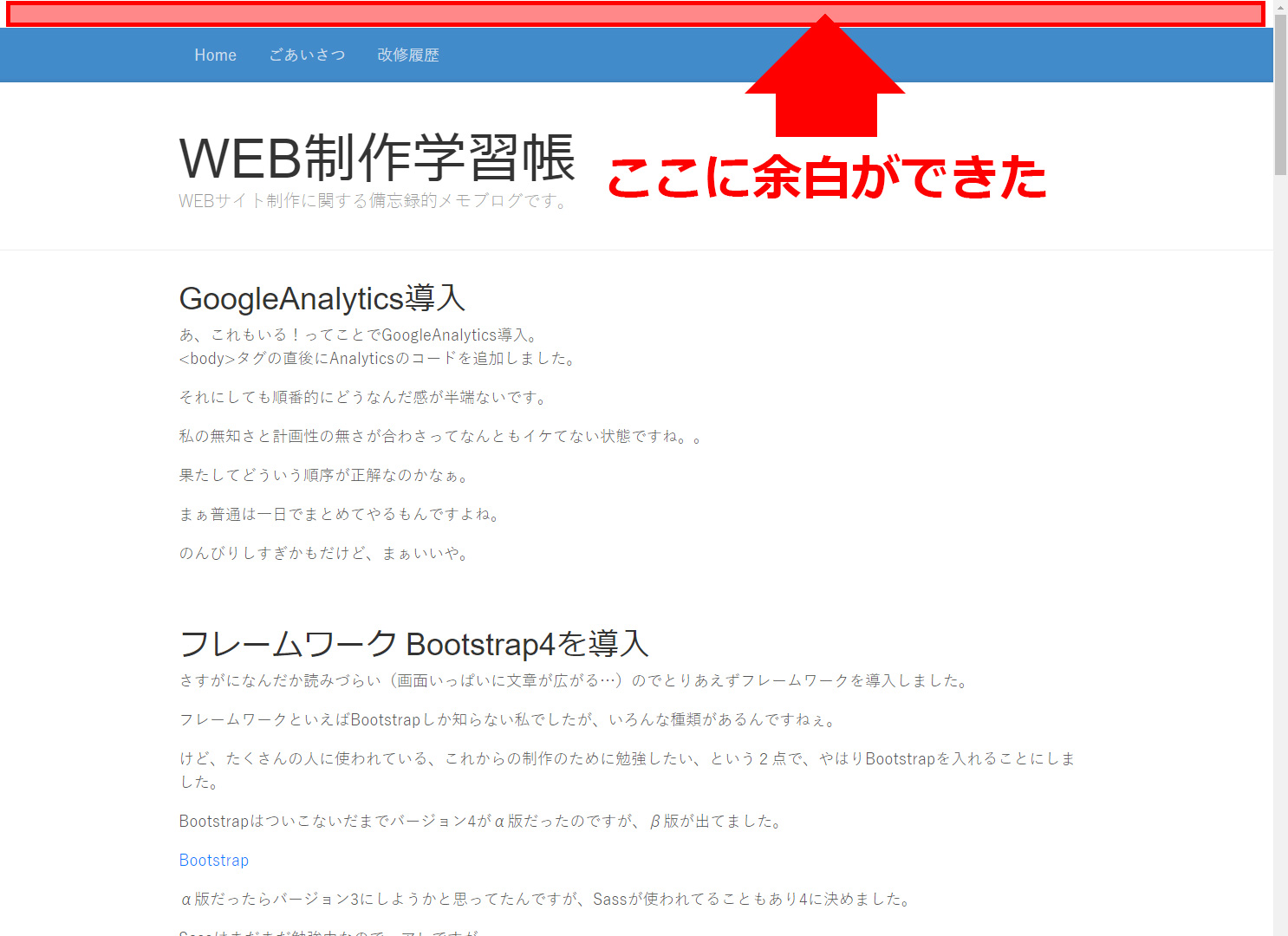
どうもhtmlに直接スタイルが記述されている模様。
<style type="text/css" media="screen">
	html { margin-top: 32px !important; }
	* html body { margin-top: 32px !important; }
	@media screen and ( max-width: 782px ) {
		html { margin-top: 46px !important; }
		* html body { margin-top: 46px !important; }
	}
</style>
調べてみると、原因はバージョン3.1から新たに導入された「管理バーの表示」という機能で、それを表示するために余白を作っているようで。。
参考にさせていただいたのはこちらのサイト。

WordPressにwp_headを入れてトップに空白ができてしまったときの対処 | 株式会社LIG(リグ)|DX支援・システム開発・Web制作
ヘッダーにwp_head();を入れたら、ページのトップに28pxの隙間が空いてしまいました。
liginc.co.jp
下記の記述をfunctions.phpに入れて無事解決!
add_filter( 'show_admin_bar', '__return_false' );